Campos y widgets
Los campos dan estructura a los modelos de una base de datos. Imagine que un modelo es una tabla o una hoja de cálculo, los campos son las columnas donde los datos se almacenan en los registros (por ejemplo, filas). Los campos también definen el tipo de datos que se almacenan en ellos. Sus widgets son los que definen cómo se presentan y se da formato a los datos en la interfaz de usuario.
Desde un punto de vista técnico, hay 15 tipos de campos en Odoo. Sin embargo, puede elegir entre 20 campos en Studio, pues algunos tipos de campos están disponibles más de una vez con un widget predeterminado distinto.
Truco
Solo puede agregar nuevos campos en las vistas de Formulario y Lista. En otras vistas, solo puede agregar campos existentes (campos que ya existen en el modelo).
Campos simples
Los campos simples contienen valores básicos, como texto, números, archivos, etc.
Nota
Non-default widgets, when available, are presented as bullet points or sub-headings below.
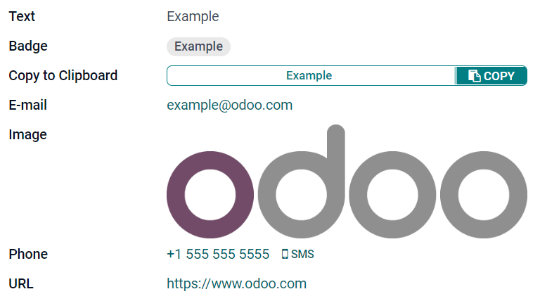
Texto (char)
El campo de Texto se utiliza para textos cortos que incluyen cualquier carácter. Aparece una línea de texto cuando se completa el campo.
Insignia: muestra el valor dentro de una forma redonda, similar a una etiqueta. El valor no se puede editar en la interfaz de usuario, pero puede establecer un valor predeterminado.
Copiar al portapapeles: los usuarios pueden copiar el valor al hacer clic en un botón.
Correo electrónico: el valor se convierte en un enlace mailto en el que se puede hacer clic.
Imagen: muestra una imagen que utiliza una URL. El valor no se puede editar de forma manual, pero se puede establecer un valor predeterminado.
Nota
This works differently than selecting the Image field directly, as the image is not stored in Odoo when using a Text field with the Image widget. For example, it can be useful if you want to save disk space.
Teléfono: el valor se convierte en un enlace tel en el que se puede hacer clic.
Truco
Seleccione Habilitar SMS para agregar la opción de enviar un SMS desde Odoo junto al campo.
URL: el valor se convierte en una URL en la que se puede hacer clic.
Example
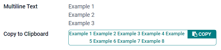
Texto multilínea (text)
El campo de Texto multilínea se utiliza para textos más largos que contienen cualquier tipo de carácter. Aparecen dos líneas de texto en la interfaz de usuario cuando se completa el campo.
Copiar al portapapeles: los usuarios pueden copiar el valor al hacer clic en un botón.
Example
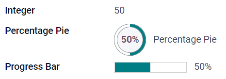
Entero (integer)
El campo entero se utiliza para todos los números enteros (positivos, negativos o cero, sin decimales).
Círculo de porcentaje: muestra el valor en un círculo de porcentaje, por lo general para valores calculados. El valor no se puede editar en la interfaz de usuario, pero puede establecer un valor predeterminado.
Barra de progreso: muestra el valor junto a una barra de porcentaje, por lo general para valores calculados. El campo no se puede editar de forma manual, pero puede establecer un valor predeterminado.
Manija: muestra un icono de manija para ordenar registros de forma manual en la vista de lista.
Example
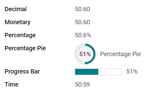
Decimal (float)
El campo de decimal se utiliza para números decimales (positivos, negativos o cero, con decimales).
Nota
Los números decimales se muestran en la interfaz de usuario con dos decimales después del punto, pero se almacenan en la base de datos con mayor precisión.
Monetary: it is similar to using the Monetary field. It is recommended to use the latter as it offers more functionalities.
Porcentaje: muestra un carácter de porcentaje
%después del porcentaje.Porcentaje circular: muestra el valor dentro de un porcentaje circular, por lo general para valores calculados. El campo no se puede editar de forma manual, pero puede establecer un valor predeterminado.
Barra de progreso: muestra el valor junto a una barra de porcentaje, por lo general para valores calculados. El campo no se puede editar de forma manual, pero puede establecer un valor predeterminado.
Tiempo: el valor debe seguir el formato hh:mm con un máximo de 59 minutos.
Example
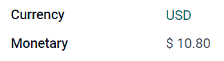
Monetario (monetary)
El campo Monetario se utiliza para todos los valores monetarios.
Nota
Cuando agrega por primera vez un campo Monetario, se le invita a agregar un campo de Divisa si no existe ninguno en el modelo. Odoo le ofrece agregar el campo de Divisa por usted. Una vez agregado, agregue el campo Monetario otra vez.
Example
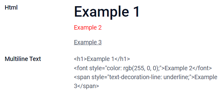
Html (html)
El campo Html se utiliza para agregar texto que se puede editar mediante el editor HTML de Odoo.
Texto multilínea: deshabilita el editor HTML de Odoo para permitir editar el HTML sin procesar.
Example
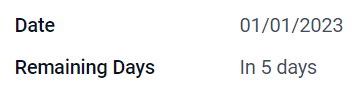
Fecha (date)
El campo Fecha se usa para seleccionar una fecha en el calendario.
Remaining Days: the remaining number of days before the selected date is displayed (e.g., In 5 days), based on the current date. This field should be set to Read only.
Example
Fecha y hora (datetime)
El campo Fecha y hora se utiliza para seleccionar una fecha en el calendario y una hora en un reloj. Si no se establece ninguna hora, se utilizará la hora actual del usuario.
Truco
As well as general properties, some specific properties are available for Date & Time fields that have the Date & Time or Date Range widget set.
Date Range (daterange)
The Date Range widget is used to display a period of time defined by a start date and an end date in a single line. A date range can have a mandatory start and end date, e.g., for a multi-day event, or allow an optional start or end date, e.g., for a field service intervention or a project task.
Adding a date range requires two fields: a Date & Time field with the Date Range widget set and another field that is selected as the start date or end date. This underlying field can be an existing Date or Date & Time field, or one created specifically for this purpose.
To add a date range:
Identify an existing Date or Date & Time field that can be used as the underlying start/end date field, or add a new one. If the date range:
has a mandatory start date and end date, this field can be either the start date or end date; the outcome is the same.
allows an optional start or end date, this field is the start date or end date, respectively.
Truco
To avoid displaying the same information twice, the underlying start/end date field can be made invisible by enabling Invisible or removed from the view by clicking Remove from view.
Add a Date & Time field and set the Widget field to Date Range.
Enter an appropriate Label.
Select the underlying start/end date field from the Start date field or End date field dropdown, as relevant.
If the date range should have a mandatory start and end date, enable Always range.
Update any other general properties or specific properties for Date & Time fields as needed, then click Close in the upper right corner of the screen.
Example
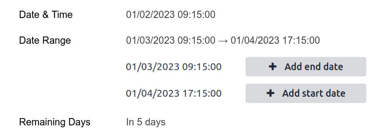
Remaining Days (remaining_days)
The Remaining Days widget displays the remaining number of days before the selected date (e.g., In 5 days), based on the current date and time. This field should be set to Read only.
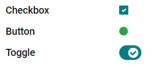
Casilla (boolean)
El campo Casilla se utiliza cuando un valor solo puede ser verdadero o falso y esto se indica al seleccionar o desmarcar una casilla.
Botón: muestra un botón de opción. El widget funciona sin tener que cambiar al modo de edición.
Activar: muestra un botón de activación. El widget funciona sin tener que cambiar al modo de edición.
Example
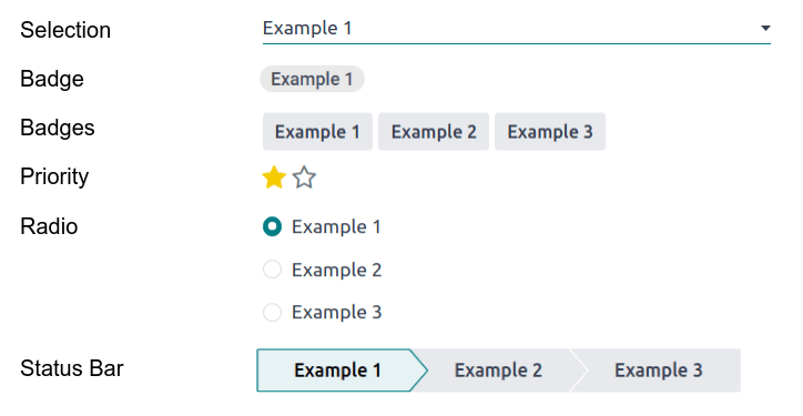
Seleccionar (selection)
El campo Selección se utiliza cuando los usuarios deben seleccionar un valor único de un grupo de valores predefinidos.
Insignia: muestra el valor dentro de una forma redonda, similar a una etiqueta. El valor no se puede editar en la interfaz de usuario, pero puede establecer un valor predeterminado.
Insignias: muestra todos los valores seleccionables dentro de formas rectangulares, organizadas de manera horizontal.
Priority: displays star symbols instead of values, which can be used to indicate an importance or satisfaction level, for example. This has the same effect as selecting the Priority field, although, for the latter, four priority values are already predefined.
Radio: muestra todos los valores seleccionables como los botones de opción.
Truco
By default, radio buttons are organized vertically. Enable Display horizontally to switch the way they are displayed.
Status Bar: displays all selectable values at the same time as an arrow progress bar.
Truco
By default, values on the status bar are selectable. Disable Clickable to prevent the value being edited on the UI.
Example
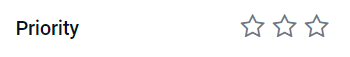
Prioridad (selection)
The Priority field is used to display a three-star rating system, which can be used to indicate importance or satisfaction level. This field type is a Selection field with the Priority widget selected by default and four priority values predefined. Consequently, the Badge, Badges, Radio, and Selection widgets have the same effects as described under Selection.
Truco
Para cambiar el número de estrellas disponibles al agregar o eliminar valores, haga clic en Editar valores. Tenga en cuenta que el primer valor es igual a 0 estrellas (es decir, cuando no se selecciona ninguna estrella), por lo que tener cuatro valores da como resultado un sistema de clasificación de tres estrellas.
Example
Archivo (binary)
El campo Archivo se utiliza para subir cualquier tipo de archivo, o para firmar un formulario (widget Firmar).
Image: users can upload an image file, which is then displayed in Form view. This has the same effect as using the Image field.
Lector de PDF: los usuarios pueden subir un archivo PDF, que puede ver desde la Vista de formulario.
Sign: users can electronically sign the form. This has the same effect as selecting the Sign field.
Example
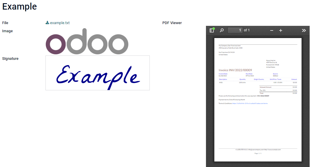
Imagen (binary)
The Image field is used to upload an image and display it in Form view. This field type is a File field with the Image widget selected by default. Consequently, the File, PDF Viewer, and Sign widgets have the same effects as described under File.
Truco
Para cambiar el tamaño de visualización de las imágenes subidas, seleccione Pequeño, Medio o Grande en la opción Tamaño.
Firmar (binary)
The Sign field is used to sign the form electronically. This field type is a File field with the Sign widget selected by default. Consequently, the File, Image, and PDF Viewer widgets have the same effects as described under File.
Truco
To give users the Auto option when having to draw their signature, select one of the available Auto-complete with fields (Text, Many2One, and Related Field on the model only). The signature is automatically generated using the data from the selected field.
Campos de relación
Los campos de relación se utilizan para vincular y mostrar los datos de los registros de otro modelo.
Nota
Algunas veces puede seleccionar widgets no predeterminados, estos aparecen como viñetas a continuación.
Many2One (many2one)
El campo Many2One se utiliza para vincular otro registro (de otro modelo) al registro que se está editando. Por lo tanto, se mostrará el nombre del registro del otro modelo en el registro que se está editando.
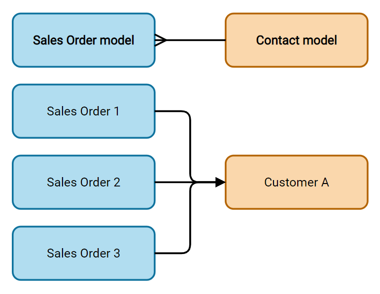
Example
En el modelo Orden de venta, el campo Cliente es un campo Many2One que dirige al modelo Contacto. Esto permite vincular varias órdenes de venta a un contacto (cliente).
Truco
Para evitar que los usuarios creen un nuevo registro en el modelo vinculado, marque Desactivar creación.
Para evitar que los usuarios abran los registros en una ventana emergente, marque Desactivar apertura.
Para ayudar a los usuarios a seleccionar únicamente el registro correcto, haga clic en Dominio para crear un filtro.
Insignia: muestra el valor dentro de una forma redonda, similar a una etiqueta, y no se puede editar en la interfaz del usuario.
Radio: muestra todos los valores seleccionables como los botones de opción.
One2Many (one2many)
El campo One2Many se usa para mostrar las relaciones existentes entre un registro del modelo actual y varios registros de otro modelo.
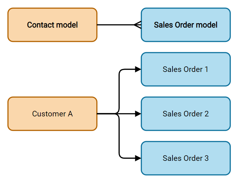
Example
Podría añadir un campo One2Many en el modelo Contacto para ver varias órdenes de venta de un cliente.
Nota
To use a One2Many field, the two models must have been linked already using a Many2One field. One2Many relations do not exist independently: a reverse-search of existing Many2One relations is performed.
Líneas (one2many)
El campo Líneas se utiliza para crear una tabla con filas y columnas (por ejemplo, las líneas de productos de una orden de venta).
Truco
Para modificar las columnas, haga clic en el campo Líneas y luego en Editar vista de lista. Haga clic en Editar vista de formulario para editar el formulario que aparece cuando un usuario hace clic en Agregar una línea.
Example

Many2Many (many2many)
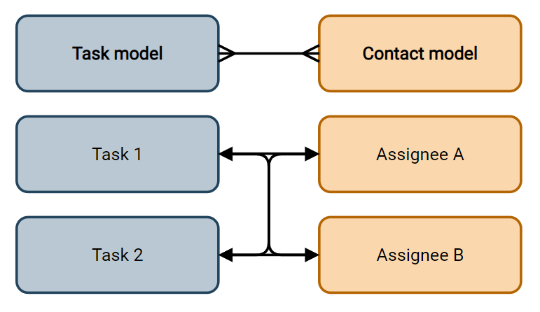
The Many2Many field is used to link multiple records from another model to multiple records on the current model. Many2Many fields can use Disable creation, Disable opening, Domain, just like Many2One fields.
Example
En el modelo Tarea, el campo Asignados es un campo Many2Many que apunta al modelo Contacto. Esto permite que un solo usuario pueda estar asignado a muchas tareas y que muchos usuarios estén asignados a una sola tarea.
Casillas: Los usuarios pueden seleccionar varios valores con las casillas.
Tags: users can select several values appearing in rounded shapes, also known as tags. This has the same effect as selecting the Tags field.
Etiquetas (many2many)
The Tags field is used to display several values from another model appearing in rounded shapes, also known as tags. This field type is a Many2Many field with the Tags widget selected by default. Consequently, the Checkboxes and Many2Many widgets have the same effects as described under Many2Many.
Truco
Para mostrar etiquetas con diferentes colores de fondo, haga clic en Usar colores.
Example

Propiedades
General properties
Invisible: Enable this property when it is not necessary for users to view a field on the UI. This helps declutter the UI by only showing the essential fields depending on a specific situation.
The Invisible attribute also applies inside Studio. To view hidden fields in Studio, click on a view’s View tab and enable Show Invisible Elements.
Required: Enable this property if a field should always be completed by the user before being able to proceed.
Readonly: Enable this property if users should not be able to modify a field.
Nota
You can choose to enable Invisible, Required and Readonly for specific records only by clicking on Conditional and creating a filter.
Example
En la vista Formulario del modelo Contacto, el campo Título solo aparece cuando se selecciona una Persona física, ya que ese campo no sería útil para un contacto tipo Empresa.
Label: the field’s name on the UI. This is not the name used in the PostgreSQL database. To view and change the latter, activate the developer mode and edit the Technical Name.
Help Tooltip: To explain the purpose of a field, add a description. The text is displayed inside a tooltip box when hovering with your mouse over the question mark beside the field’s label.
Widget: Si desea cambiar la apariencia o función predeterminada de un campo, seleccione uno de los widgets disponibles.
Placeholder: To provide an example of how a field should be completed, add placeholder text. The text appears in light gray until a value is entered.
Default value: To display a default value in a field when a record is created, add a value.
Allow visibility to groups: To limit which users can view the field, select one or more user access groups.
Forbid visibility to groups: To prevent certain users from seeing the field, select one or more user access groups.
Properties for Date & Time fields
For Date & Time fields that have the Date & Time or Date Range widget set, some specific properties are available:
Time interval: Enter a value to determine the minute intervals shown in the time selector. For example, enter 15 to allow quarter-hour intervals. The default value is set to 5 minutes.
Warning for future dates: Enable this property to display a warning icon if a future date is selected.
Show time: This property is enabled by default for Date & Time fields. On a read-only field, disable the property to show only the date. This can keep a list view less cluttered, for example.
Earliest accepted date: Enter the earliest date that can be selected in the date selector in ISO-format, i.e.,
YYYY-MM-DD. If the current date is always the earliest accepted date, entertoday. On the date selector, dates prior to the earliest accepted date are grayed out.Latest accepted date: Enter the latest date that can be selected in the date selector in ISO-format, i.e.,
YYYY-MM-DD. If the current date is always the latest accepted date, entertoday. On the date selector, dates later than the latest accepted date are grayed out.