Fält och widgetar
Fält strukturerar modellerna i en databas. Om du tänker dig en modell som en tabell eller ett kalkylblad är fälten de kolumner där data lagras i posterna (dvs. raderna). Fälten definierar också vilken typ av data som lagras i dem. Hur data presenteras och formateras på UI definieras av deras widget.
Ur teknisk synvinkel finns det 15 fälttyper i Odoo. Du kan dock välja mellan 20 fält i Studio, eftersom vissa fälttyper är tillgängliga mer än en gång med en annan standardwidget.
Enkla fält
Enkla fält innehåller grundläggande värden, t.ex. text, siffror, filer etc.
Observera
Non-default widgets, when available, are presented as bullet points or sub-headings below.
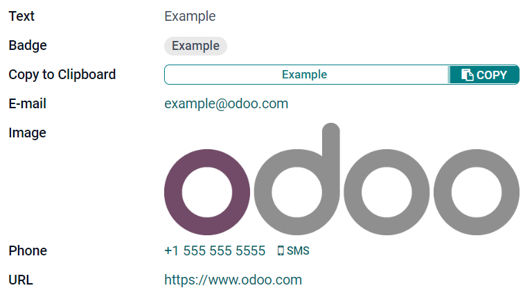
Text (char)
Fältet Text används för kort text som innehåller valfritt tecken. En textrad visas när fältet fylls i.
Badge: visar värdet inuti en rundad form, liknande en tagg. Värdet kan inte redigeras i användargränssnittet, men ett standardvärde kan anges.
Copy to Clipboard: användare kan kopiera värdet genom att klicka på en knapp.
E-post: värdet blir en klickbar mailto-länk.
Image: visar en bild med hjälp av en URL. Värdet kan inte redigeras manuellt, men ett standardvärde kan anges.
Observera
This works differently than selecting the Image field directly, as the image is not stored in Odoo when using a Text field with the Image widget. For example, it can be useful if you want to save disk space.
Phone: värdet blir en klickbar tel-länk.
Tips
Bocka i Enable SMS för att lägga till ett alternativ för att skicka ett SMS direkt från Odoo bredvid fältet.
URL: värdet blir en klickbar URL.
Example
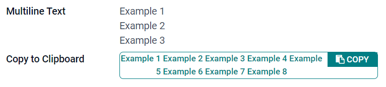
Text med flera rader (text)
Fältet Multiline Text används för längre text som innehåller alla typer av tecken. Två textrader visas på användargränssnittet när fältet fylls i.
Copy to Clipboard: användare kan kopiera värdet genom att klicka på en knapp.
Example
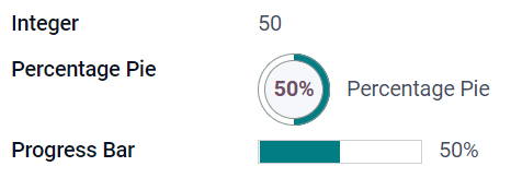
Heltal (integer)
Fältet Integer används för alla heltal (positivt, negativt, eller noll, utan decimal).
Percentage Pie: visar värdet inuti en procentcirkel, vanligtvis för ett beräknat värde. Värdet kan inte redigeras i användargränssnittet, men ett standardvärde kan anges.
Progressstapel: visar värdet bredvid en procentstapel, vanligtvis för ett beräknat värde. Fältet kan inte redigeras manuellt, men ett standardvärde kan anges.
Handle: visar en draghandtagsikon för att beställa poster manuellt i Listvy.
Example
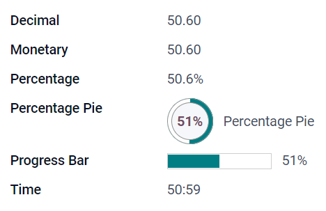
Decimal (float)
Fältet Decimal används för alla decimaltal (positiv, negativ eller noll, med decimal).
Observera
Decimaltal visas med två decimaler efter decimaltecknet på användargränssnittet, men de lagras i databasen med större precision.
Monetary: it is similar to using the Monetary field. It is recommended to use the latter as it offers more functionalities.
Percentage: visar ett procenttecken
%efter värdet.Percentage Pie: visar värdet i en procentcirkel, vanligtvis för ett beräknat värde. Fältet kan inte redigeras manuellt, men ett standardvärde kan anges.
Progressstapel: visar värdet bredvid en procentstapel, vanligtvis för ett beräknat värde. Fältet kan inte redigeras manuellt, men ett standardvärde kan anges.
Time: värdet måste följa formatet hh:mm, med ett maximum på 59 minuter.
Example
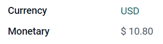
Monetära (monetära)
Fältet Monetary används för alla monetära värden.
Observera
När du först lägger till ett Monetary-fält uppmanas du att lägga till ett Currency-fält om det inte redan finns något i modellen. Odoo erbjuder sig att lägga till Currency-fältet åt dig. När det har lagts till lägger du till Monetary-fältet igen.
Example
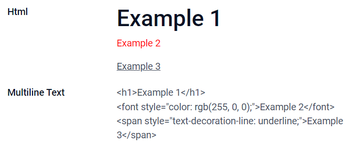
Html (html)
Fältet Html används för att lägga till text som kan redigeras med Odoos HTML-redigerare.
Multiline Text: inaktiverar Odoo HTML-editor för att tillåta redigering av rå HTML.
Example
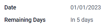
Datum (datum)
Fältet Date används för att välja ett datum i en kalender.
Remaining Days: the remaining number of days before the selected date is displayed (e.g., In 5 days), based on the current date. This field should be set to Read only.
Example
Datum och tid (datetime)
Fältet Datum & Tid används för att välja ett datum i en kalender och en tid i en klocka. Användarens aktuella tid används automatiskt om ingen tid anges.
Tips
As well as general properties, some specific properties are available for Date & Time fields that have the Date & Time or Date Range widget set.
Date Range (daterange)
The Date Range widget is used to display a period of time defined by a start date and an end date in a single line. A date range can have a mandatory start and end date, e.g., for a multi-day event, or allow an optional start or end date, e.g., for a field service intervention or a project task.
Adding a date range requires two fields: a Date & Time field with the Date Range widget set and another field that is selected as the start date or end date. This underlying field can be an existing Date or Date & Time field, or one created specifically for this purpose.
To add a date range:
Identify an existing Date or Date & Time field that can be used as the underlying start/end date field, or add a new one. If the date range:
has a mandatory start date and end date, this field can be either the start date or end date; the outcome is the same.
allows an optional start or end date, this field is the start date or end date, respectively.
Tips
To avoid displaying the same information twice, the underlying start/end date field can be made invisible by enabling Invisible or removed from the view by clicking Remove from view.
Add a Date & Time field and set the Widget field to Date Range.
Enter an appropriate Label.
Select the underlying start/end date field from the Start date field or End date field dropdown, as relevant.
If the date range should have a mandatory start and end date, enable Always range.
Update any other general properties or specific properties for Date & Time fields as needed, then click Close in the upper right corner of the screen.
Example
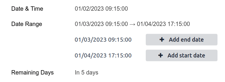
Remaining Days (remaining_days)
The Remaining Days widget displays the remaining number of days before the selected date (e.g., In 5 days), based on the current date and time. This field should be set to Read only.
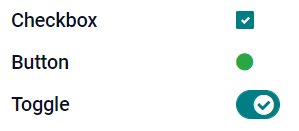
Kryssruta (boolean)
Fältet Checkbox används när ett värde endast ska vara sant eller falskt, vilket anges genom att markera eller avmarkera en kryssruta.
Button: visar en radioknapp. Widgeten fungerar utan att växla till redigeringsläget.
Toggle: visar en växlingsknapp. Widgeten fungerar utan att växla till redigeringsläget.
Example
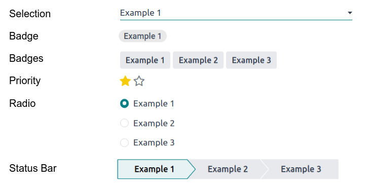
Urval (urval)
Fältet Selection används när användare ska välja ett enskilt värde från en grupp fördefinierade värden.
Badge: visar värdet inuti en rundad form, liknande en tagg. Värdet kan inte redigeras i användargränssnittet, men ett standardvärde kan anges.
Badges: visar alla valbara värden samtidigt i rektangulära former, organiserade horisontellt.
Priority: displays star symbols instead of values, which can be used to indicate an importance or satisfaction level, for example. This has the same effect as selecting the Priority field, although, for the latter, four priority values are already predefined.
Radio: visar alla valbara värden samtidigt som radioknappar.
Tips
By default, radio buttons are organized vertically. Enable Display horizontally to switch the way they are displayed.
Status Bar: displays all selectable values at the same time as an arrow progress bar.
Tips
By default, values on the status bar are selectable. Disable Clickable to prevent the value being edited on the UI.
Example
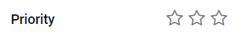
Prioritet (urval)
The Priority field is used to display a three-star rating system, which can be used to indicate importance or satisfaction level. This field type is a Selection field with the Priority widget selected by default and four priority values predefined. Consequently, the Badge, Badges, Radio, and Selection widgets have the same effects as described under Selection.
Tips
Klicka på Edit Values om du vill ändra antalet tillgängliga stjärnor genom att lägga till eller ta bort värden. Observera att det första värdet är lika med 0 stjärnor (dvs. när inget val görs), så att ha fyra värden resulterar i ett trestjärnigt klassificeringssystem, till exempel.
Example
Fil (binär)
Fältet File används för att ladda upp valfri typ av fil, eller signera ett formulär (Sign widget).
Image: users can upload an image file, which is then displayed in Form view. This has the same effect as using the Image field.
PDF Viewer: användare kan ladda upp en PDF-fil, som sedan kan läsas från Formulärvyn.
Sign: users can electronically sign the form. This has the same effect as selecting the Sign field.
Example
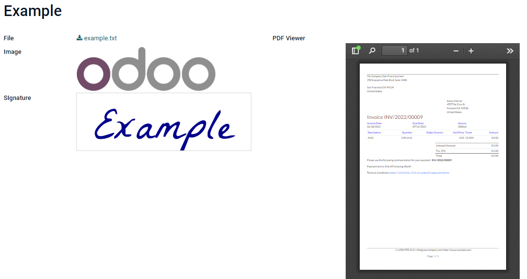
Bild (binär)
The Image field is used to upload an image and display it in Form view. This field type is a File field with the Image widget selected by default. Consequently, the File, PDF Viewer, and Sign widgets have the same effects as described under File.
Tips
För att ändra visningsstorleken på uppladdade bilder, välj Small, Medium, eller Large under alternativet Size.
Tecken (binär)
The Sign field is used to sign the form electronically. This field type is a File field with the Sign widget selected by default. Consequently, the File, Image, and PDF Viewer widgets have the same effects as described under File.
Tips
To give users the Auto option when having to draw their signature, select one of the available Auto-complete with fields (Text, Many2One, and Related Field on the model only). The signature is automatically generated using the data from the selected field.
Relationella fält
Relationsfält används för att länka och visa data från poster i en annan modell.
Observera
Widgetar som inte är standard, när sådana finns, presenteras som punktlistor nedan.
Many2One (many2one)
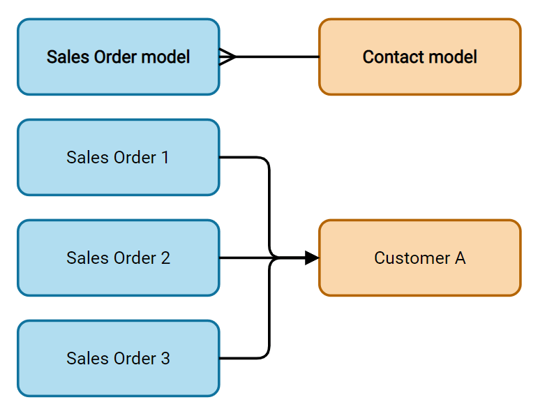
Fältet Many2One används för att länka en annan post (från en annan modell) till den post som redigeras. Postens namn från den andra modellen visas sedan på den post som redigeras.
Example
I modellen Säljorder är fältet Customer ett Many2One-fält som pekar på modellen Contact. Detta gör att många försäljningsorder kan kopplas till en kontakt (kund).
Tips
För att hindra användare från att skapa en ny post i den länkade modellen, kryssa i Inaktivera skapande.
För att förhindra användare från att öppna poster i ett popup-fönster, bocka i Inaktivera öppning.
För att hjälpa användare att bara välja rätt post, klicka på Domän för att skapa ett filter.
Badge: visar värdet inuti en rundad form, liknande en tagg. Värdet kan inte redigeras i användargränssnittet.
Radio: visar alla valbara värden samtidigt som radioknappar.
One2Many (one2many)
Fältet One2Many används för att visa de befintliga relationerna mellan en post i den aktuella modellen och flera poster från en annan modell.
Example
Du kan lägga till ett One2Many-fält på Contact-modellen för att titta på en kunds många försäljningsorder.
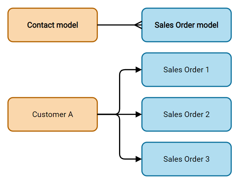
Observera
To use a One2Many field, the two models must have been linked already using a Many2One field. One2Many relations do not exist independently: a reverse-search of existing Many2One relations is performed.
Linjer (one2many)
Fältet Lines används för att skapa en tabell med rader och kolumner (t.ex. raderna med produkter på en försäljningsorder).
Tips
Om du vill ändra kolumnerna klickar du på fältet Lines och sedan på Edit List View. Om du vill redigera formuläret som visas när en användare klickar på Lägg till en rad, klickar du istället på Redigera formulärvy.
Example
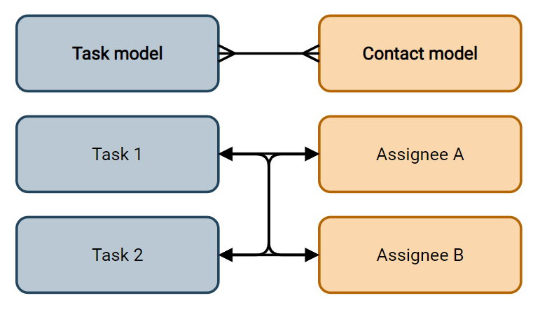
Many2Many (many2many)
The Many2Many field is used to link multiple records from another model to multiple records on the current model. Many2Many fields can use Disable creation, Disable opening, Domain, just like Many2One fields.
Example
I modellen Task är fältet Assignees ett Many2Many-fält som pekar på modellen Contact. Detta gör att en enskild användare kan tilldelas många uppgifter och många användare kan tilldelas en enskild uppgift.
Checkboxes: användarna kan välja flera värden med hjälp av kryssrutor.
Tags: users can select several values appearing in rounded shapes, also known as tags. This has the same effect as selecting the Tags field.
Etiketter (many2many)
The Tags field is used to display several values from another model appearing in rounded shapes, also known as tags. This field type is a Many2Many field with the Tags widget selected by default. Consequently, the Checkboxes and Many2Many widgets have the same effects as described under Many2Many.
Tips
För att visa taggar med olika bakgrundsfärger, kryssa i Use colors.
Example

Fastigheter
General properties
Invisible: Enable this property when it is not necessary for users to view a field on the UI. This helps declutter the UI by only showing the essential fields depending on a specific situation.
The Invisible attribute also applies inside Studio. To view hidden fields in Studio, click on a view’s View tab and enable Show Invisible Elements.
Required: Enable this property if a field should always be completed by the user before being able to proceed.
Readonly: Enable this property if users should not be able to modify a field.
Observera
You can choose to enable Invisible, Required and Readonly for specific records only by clicking on Conditional and creating a filter.
Example
I vyn Formulär i modellen Kontakt visas fältet Titel bara när Individuell är markerad, eftersom det fältet inte skulle vara användbart för en Företag-kontakt.
Label: the field’s name on the UI. This is not the name used in the PostgreSQL database. To view and change the latter, activate the developer mode and edit the Technical Name.
Help Tooltip: To explain the purpose of a field, add a description. The text is displayed inside a tooltip box when hovering with your mouse over the question mark beside the field’s label.
Widget: För att ändra standardutseende eller funktionalitet för ett fält, välj en av de tillgängliga widgetarna.
Placeholder: To provide an example of how a field should be completed, add placeholder text. The text appears in light gray until a value is entered.
Default value: To display a default value in a field when a record is created, add a value.
Allow visibility to groups: To limit which users can view the field, select one or more user access groups.
Forbid visibility to groups: To prevent certain users from seeing the field, select one or more user access groups.
Properties for Date & Time fields
For Date & Time fields that have the Date & Time or Date Range widget set, some specific properties are available:
Minimal precision: Determine the smallest date unit that must be selected in the date selector. The possible values are Day, Month, Year or Decade. If no value is selected, the user must select a day in the date selector.
Maximal precision: Determine the largest date unit that can be used to navigate the date selector. The possible values are Day, Month, Year or Decade. If no value is selected, the user can navigate the date selector by decade.
Warning for future dates: Enable this property to display a warning icon if a future date is selected.
Condensed display: Enable this property to show days, months and hours with no leading zeros, e.g.,
4/2/2025 8:05:00instead of04/02/2025 08:05:00.Show time: This property is enabled by default for Date & Time fields. On a read-only field, disable the property to show only the date. This can keep a list view less cluttered, for example.
Show seconds: This property is enabled by default for Date & Time fields. Disable the property to show only hours and minutes.
Time interval: Enter a value to determine the minute intervals shown in the time selector. For example, enter 15 to allow quarter-hour intervals. The default value is set to 5 minutes.
Earliest accepted date: Enter the earliest date that can be selected in the date selector in ISO-format, i.e.,
YYYY-MM-DD. If the current date is always the earliest accepted date, entertoday. On the date selector, dates prior to the earliest accepted date are grayed out.Latest accepted date: Enter the latest date that can be selected in the date selector in ISO-format, i.e.,
YYYY-MM-DD. If the current date is always the latest accepted date, entertoday. On the date selector, dates later than the latest accepted date are grayed out.